Meet the New Jerk Centre Symbol
If you have visited the Jerk Centre website recently, you may already have noticed a little something new sitting in your browser tab.
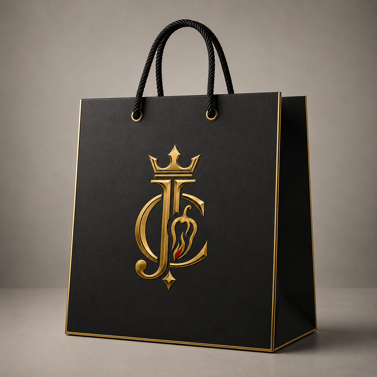
We are delighted to introduce the new Jerk Centre symbol — a distinctive signature mark created to sit alongside our established branding and become another instantly recognisable part of Jerk Centre.
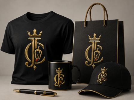
Its first official appearance is as our new website favicon, but that is only the beginning. Over time, you will start to see the symbol appearing throughout our artwork, promotional materials, event displays, marketing and wherever a compact Jerk Centre signature feels right.
Meet the New Jerk Centre Symbol
Our main Jerk Centre identity is not going anywhere. The new symbol has been created to complement the brand rather than replace it.
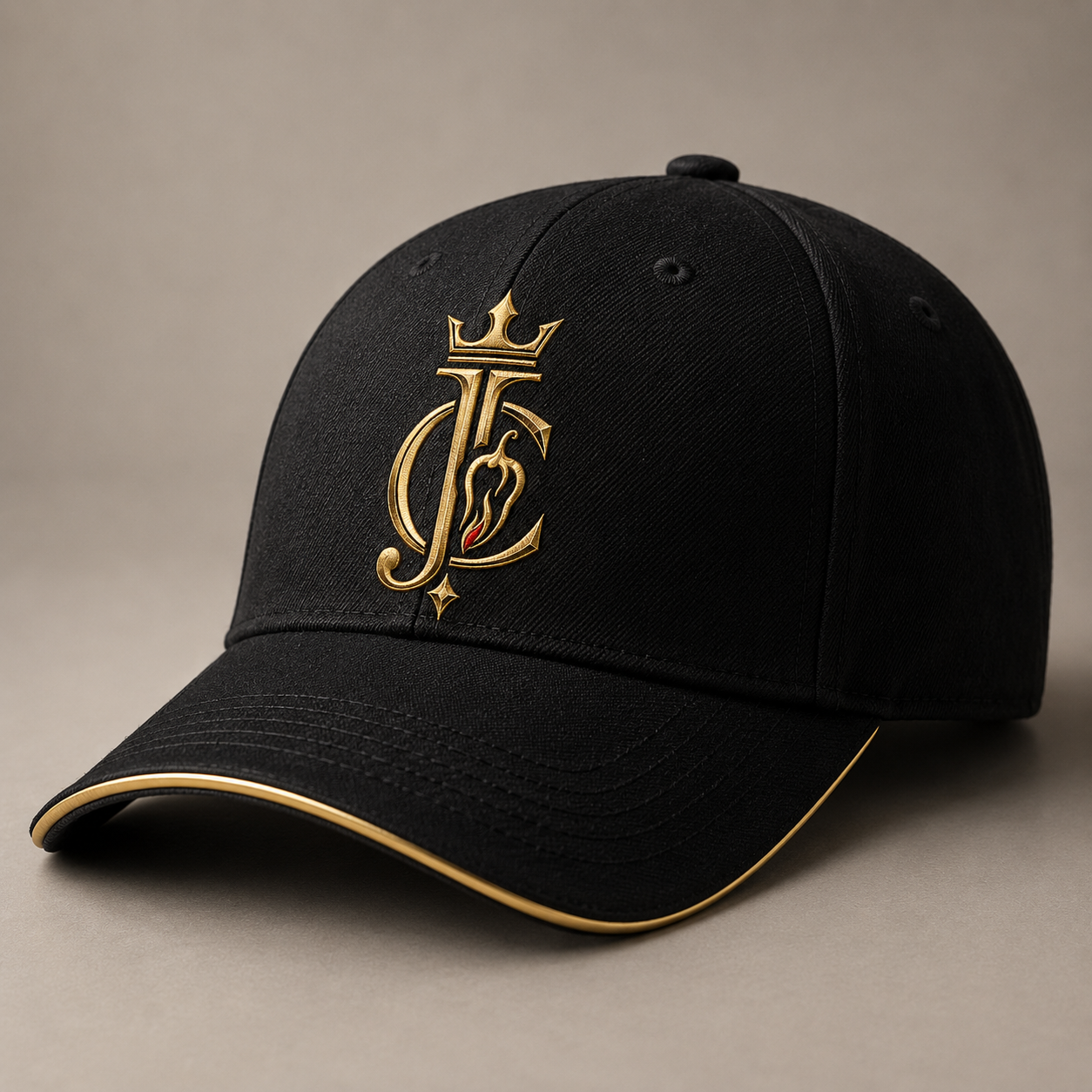
At its heart are the initials J and C, brought together into a single distinctive emblem and topped with a crown. Within the design sits a chilli-inspired detail, connecting the symbol back to the flavour, heat and personality at the centre of what we do.
Finished in gold, the design has a confident, premium feel while still retaining that unmistakable bit of Jerk Centre attitude.
The idea was simple: create something that could be recognised as Jerk Centre even when the full name isn’t shown.
There Is a Story in the Details
Every part of the symbol has been chosen to say something about the brand.
The J and C make the connection to Jerk Centre immediate, while the crown brings a sense of confidence, pride and ambition.
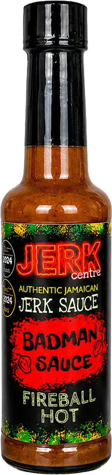
The The Scotch Bonnet and flame-inspired detail brings everything back to where it should be — the food. From the gentler warmth of Taste From the Ancestors through to the uncompromising fire of Badman Sauce, chilli has always been part of Jerk Centre’s personality.
And then there is the gold.
For us, it gives the mark a feeling of quality and achievement while helping it stand confidently on its own, whether it appears large on promotional artwork or tiny in the corner of a browser tab.
It may be a compact symbol, but there is plenty of Jerk Centre packed into it.
You’ll Start Seeing It in More Places
The website favicon is simply its first outing.
Rather than changing everything overnight, we are going to introduce the new symbol gradually and allow it to become familiar naturally.
You may begin to spot it appearing on social media artwork, promotional graphics, event materials, exhibition displays, marketing pieces and future Jerk Centre designs.
There will be places where our full Jerk Centre branding remains exactly the right choice, and others where the new symbol can act almost like a signature.
That flexibility is exactly why we wanted it.
So the next time you see that little gold crown, J and C, and chilli detail somewhere in the wild, you will know exactly who it belongs to.
The Same Jerk Centre, With a New Signature
Brands grow, and as Jerk Centre continues to grow, we want the identity around it to grow too.
What is not changing is everything that matters.
The sauces are still packed with the Jamaican flavours we love. The personalities behind Taste From the Ancestors, Duppy Conqueror, Badman Sauce and Yardie Drizzle are still very much alive and kicking.
We are still Jerk Centre.
This new symbol simply gives us another way of putting our stamp on things.
Small enough to sit in a browser tab.
Distinctive enough to stand proudly on a piece of artwork.
And unmistakably ours.
So consider this your official introduction.
From Elka at Jerk Centre
I wanted us to have something that people could eventually look at and recognise as Jerk Centre without needing to see the whole name.
The symbol still carries the personality of the brand — the J and C, the crown, the chilli and that little bit of fire — but brings everything together into one strong mark.
Seeing it appear on the website for the first time feels like a small moment, but an exciting one. I’m really looking forward to watching it gradually become part of Jerk Centre as we continue to grow.